Monday, February 28, 2011
Friday, February 18, 2011


 I did birthday pictures because there are many colors that are bright and stand out in the photo to begin with. I tried to use interesting angles that aren't usually seen. I also made more contrast so that the color would be more vibrant. I cropped the pictures to follow the rule of thirds. I also used a large aperture on the cupcake and flower photos.
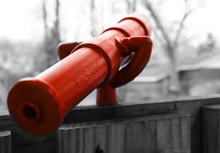


For this color emphasis project an important principle was desaturation, because that made the color portion stand out. I learned how to use masking to make certain areas stick out by leaving them in color. I also learned how to change the color such as the picture of the basketball hoop. I changed the exposure on some photos to make them look better. I also had to crop the one of the boy playing basketball because it didn't originally have good composition and now it follows the rule of thirds.


For this project I used some photos that I had from past projects. The one that features the purple glass next to the bottles features use of depth of field. The picture with the pink balloons features the ruleof thirds in its pure form. This photo also shows depth of field. By desaturating each image, the colors emphasized stand out distinctly against the background. The photo of the kitten shows texture, in the form of its fuzzy wuzzy fur. The pink shcrimps picture has the girl in front completely in focus and the background is blurred.
DoubleNegative


During this project I had to lower the opacity on most of the photos. You had to work hard with adjusting the layers in order to create the overlapping effect. All of my photos are desaturated and has the contrast edited in order to make them look more eye- catching.
Double negatives


For this project I cropped some of the images to fit better with the other picture. I also had increased the brightness and contrast on a few of the pictures as well. For some of the pictures, like the one with the apple, I used the brush tool so the apple was a bit more obvious instead of just blending in with the other picture. I also desaturated the picture with my dog (the black and white picture).
Double Negatives


In my double negatives assignment, I tried to use texture as well as color empasis. Next time I will work harder on rule of thirds, like in the second pictures compisition.
Thursday, February 17, 2011
Double negative


For this double negative project i foucused mainly on contrast. I used a lot of texture to emphasize certain parts of the picture. I used lightness and darkness to really emphasize the composition.
Color emphasis


To create interest in my photos I selected ones with a different point of view so they weren't all the same. One of my favorites is the ski lift going through the trees. I colored a seat on the side of the photo to follow the rule of thirds. The long depth of field in this picture allows the view to see all the way to the top of the mountian and adds balance. When working with this photo I also hightened the contrast so the snow was brighter and the wooded areas darker.


Wednesday, February 16, 2011


ColorEmphasis


 In the color emphasis project, I really had to concentrate on the brightness of my subjects. I had to use the layer mask in order to keep the colors and black and whites separate. I fixed the hue and saturation on my pictures to make the colors look better against the desaturated background.
Subscribe to:
Posts (Atom)