Tuesday, March 29, 2011
Friday, March 25, 2011
spring break ideas
a playground
basketball court or baseball fields
path through trees
something in downtown wheaton
basketball court or baseball fields
path through trees
something in downtown wheaton
Panoramas
The College Church Sanctuary.
A hillside stretching over train track in Maryland.
The statues of Native Americans on horseback by Millenium Park in Chicago.
A hillside stretching over train track in Maryland.
The statues of Native Americans on horseback by Millenium Park in Chicago.
Thursday, March 24, 2011

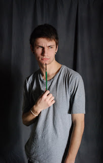


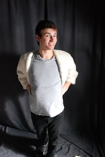
For the model shot, I had to adjust the aperture to make up for the lighting because the shutter speed had to be at a certain speed to sync up with the lighting. In photoshop I used Gaussian Blur over the photos to make Kevin Weeders skin soft and lovely. I also cropped pictures in order to make a good composition. I created a masque on the photos after the blur and revealed Kevin's crisp clear eyes.
Wednesday, March 23, 2011
Tuesday, March 22, 2011
Portrait Summary
Studio shooting was really good to help me better my knowledge of the camera. All of the lighting was important in seeing how your picture turned out. Having to take portraits of people helped me on my perspective and angles while shooting. Also, it was interesting to see how the flash and lighting made different features more prominent than others in the portraits.
Portraits Pt.2
Well blogger isn't letting me post the rest of my pics for some reason, so I'll try later. In the meantime, here is my summary:
For my Portrait project I tried to use a variety of lighting to create dynamic images. I also experimented with different subject placements to see which created the best composition. I like the portraits a lot more in black and white, because I feel that it emphasizes the subject more, where as color can become distracting. My favorite picture is probably the soft focus one of Kaity, because I feel like it gives the image a really cool look.
Subscribe to:
Comments (Atom)


